A professional web designer will do most of his text formatting and positioning with CSS (that is covered in the CSS chapters of the Primer), but HTML remains the needed basis for virtually every part of the web design process. Older but still valid specifications of the language allow for formatting of text and design using exclusively HTML tags, without any CSS. Since the goal of the Primer is to enable you to achieve maximum results with the minimum reasonable amount of effort, our examples leave those obsolete conventions aside and assume that you will use CSS for the finer points of web design.
As awesome for design as CSS is, it can do nothing if your text has not been properly arranged in HTML first. Headlines need to be inside dedicated H tags, while regular text goes in paragraphs and with the appropriate line breaking applied. Only after that the positioning and appearance issues can be addressed.
The Paragraph and Break Tags
Text in HTML documents is usually enclosed in paragraph tags, and new lines break using the break tag. For example, it you type in the following:
<p>This is my first line.
<br>
This is my second line.</p>
<p>This is a new paragraph</p>
...and open the document in a browser, you will see the two lines like this:
This is my first line
This is my second line.
This is a new paragraph
<br /> or <br>?
In XHTML, "empty" tags, meaning tags lacking a closing tag, should have an " /" before the closing "bigger than" symbol.
Examples are <b />, <hr />, <img src="some_image.gif" />.
Bold, Italics, Underline
The three most common text decorations are bold text, italic text, and underlined text.
Bold text is created using the <strong> or the <b> tags.
Italic text is created with the <em> or the <i> tags.
Underlining is done with <u> tag.
Aligning Text
Text can be aligned by using the align attribute. Text can aligned to the right, left, or center.
For example, if you need you text to appear at the right-hand side of the browser window, you need to format it like this.
<p align="right">This text is aligned to the right.</p>
The above is an example of a situation that has more than one solutions. The same result can be accomplished using a simple CSS rule. The Primer will attempt to promote good practices, and as such, we recommend separation of content from presention via the use of CSS for formatting.
Headlines
There are six types of headline tags, or headings. Aside from providing a shortcut for creating larger text, they provide a logical hierarchy for ordering content.
While you can simulate the "headline effect" by playing with the text's weight and size, keep in mind that correct HTML is not about looks only: by using the headline tags you can semantically order your text.
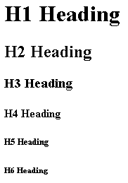
The following code:
<h1>This is H1 Headline</h1>
<h2>This is H2 Headline</h2>
<h3>This is H3 Headline</h3>
<h4>This is H4 Headline</h4>
<h5>This is H5 Headline</h5>
<h6>This is H6 Headline</h6>
...renders like this:

If you take a closer look, you will notice that the heading rendering is an image. Often, various publications platforms will have their own specifications for heading tags. The above image displays the default rendering in a mainstream browser.
Lists
Often, a page has to include bulleted or numbered lists of various things; in HTML, you don't have to format those manually. Using one of the several list types available, you can easily construct ordered lists of items.
Ordered Lists
<ol>
<li>Item 1</li>
<li>Item 2</li>
</ol>
The above code renders as:
- Item 1
- Item 2
<ol type="A">
 <li>Item 1</li>
 <li>Item 2</li>
 <li>Item 3</li>
</ol>
The above code renders as:
- Item 1
- Item 2
- Item 3
Unordered Lists
<ul>
 <li>Item 1</li>
 <li>Item 2</li>
</ul>
The above code renders as:
- Item 1
- Item 2
